
Branding a collection “Vintage Reproduction Imagery” one pearl at a time.
This journey started a little more than a year ago. I was commissioned to do a project at the new Fox & Fiddle Restaurant in Winnipeg. They requested vintage images of Winnipeg to match their historic building site. Image files were acquired through an archives service and the body of work chosen was from the iconic Winnipeg photographer, L.B. Foote. Foote was a prolific Winnipeg photographer who accumulated the largest collection of photo’s from the early history of Winnipeg’s business districts, but, he also shot sporting teams and clubs including some macabre murder scenes for the press. He became the city’s photographer of choice for official visits by dignitaries like King George & Queen Elizabeth from their respective reigns.
1914 Winnipeg Auto Club
I completed this commission by creating 14 individual collages panels of images in tones that matched their decor of black & white marble. The three foot high panels were printed on a vintage smooth texture paper that added further detail and dimension to the project. After its completion I thought it would be an interesting study to take some current images and try to replicate this early look and feel. Of course it had to have an element of artistic interpretation that could be uniquely defined for a body of work, a canned sepia like tint on a B&W image would not suffice. The oysters seed had been planted and now the creative juices needed to bring it to life to see if a pearl could be created.
When I began the study I quickly realize that ultimately I wanted to create a baseline formula that could be applied to most any composition then hand detailed and finished specific to the image. This was completely different from my past works which were very individualistic, time and software intensive and very difficult to reproduce if a collection was required.
As luck would have it I received a call to submit ideas for a provincial commission. They were looking for iconic vintage architectural builds with a bit of a grunge look in an updated contemporary perspective. I accepted the challenge and proceeded to explore and shoot a specific collection for the project. I submitted a set of 20 images for consideration, each was prepared to specifications based on the decor and the specific boardroom requirements. Further consultations, discussions and additional fine tuning secured the project. In the end we selected and produced a set of 4, one off, digitally hand coloured pieces. Each image was digitally mastered and printed on French cold press art paper with a hand torn dappled edge. The prints were mounted and matted in a custom pewter shallow shadow box frame produced by master framer Barry Striemer.
This triptych depicts the essence of the growing culture of the City of Winnipeg during the late 19th century. The historic and stoic entrance of the Winnipeg Law Courts building emits a sense of strength. The turret above portrays justice with its view points overlooking the land to the North, South, East and West. The Land Titles entrance emits grace and style giving settlers a sense of honor as they approach these grand doors applying for
land titles.
At the unveiling in the Civil Service Commission boardroom, Corporate Office Administrator Pauline Gagnon and Deputy Minister Debra Woodgate were enamored with the finished look and feel of the images. They were deeply touched when they learned of the accompanying story lines behind each image. Not only were the images appealing but the story behind each image gave it an additional depth and relevancy they had not expected. Deputy Minister Debra Woodgate requested that a gallery tag accompany each image completing the instillation. It was an important commission for me in my development and these details are part of who I am. The first stage of the pearls development was now cast.
I knew then the processing formula was on the right track but I had to refine it to be able to produce a series or collection of work. The second hybrid set was of the historic “Grants Mill”. There were six images created which I posted on my facebook site back in early Feb., 2013 to receive feed back. The collection garnered some very positive comments but as I viewed it on line I felt it just wasn’t quite there yet, to contrived, it didn’t feel it was truly part of the story of the image set. So I went back to the drawing board and over a period of 6-7 weeks it became much more distinctive and refined.

The oldest flower mill in western Canada.

Detail of Grants Mill in Winnipeg, MB., Canada
Searching through my archives I found a collection of images taken in the east Kooteny Mtns. a few years back. The images were filled with local history and an infinite amount of detail to challenge this concept. Processing this set I could feel it brought me closer to what I was looking for. The diversity of the images combined with this developing formula had me convinced it was doable. A tweak here, a push there and they came out with a sense and sensibility of character and in some cases with very little intervention. Still each image required specific details that can only be done by hand. I cherished the individualistic nature of this process as it allows me to delve deeply into each image and pull out the intimacies as I remembered capturing them. Within each image there is a dappled light created by a canopy of mature fir and cedar trees that is a significant part of the charm of this area. The technique handled this with a grace befitting these hallowed intimate landscapes. Of this set of approximately 70 images I submitted 5 into a local photo competition to be adjudicated and receive feed back. The critique was very interesting culminating with two images winning awards of first and second place in the senior colour print category. One image one became the “Image of the Month” in the competition. The members of the photographic association recognize and expressed interest in the style and feel of these images. This has help build credence for establishing this branded style for a collection. The pearl is gaining momentum in its growth.
Situated in the East Kootenay Mtns of BC.
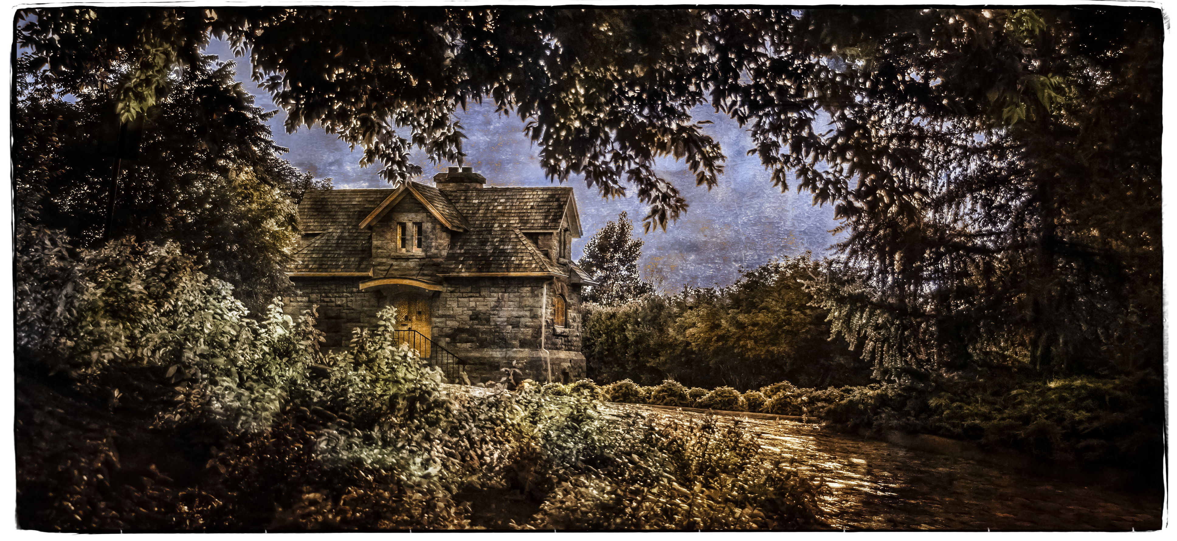
Earl’s place was a favorite haunt for me, I learned that Hollywood loved it to as 3-4 movies were shot here at Earl’s house.
To test the waters further I introduced some other genres and one I have is a good collection of are wildlife images. Would the concept work with a set of imagery that has a completely different set of demands in post production. I tried it with different types of subjects, light and background looks. It worked well but it takes some extra tweaking to bring out the details of the individual animal species in their environments but over all I was happy with the results.

Capture near Jasper Alberta.
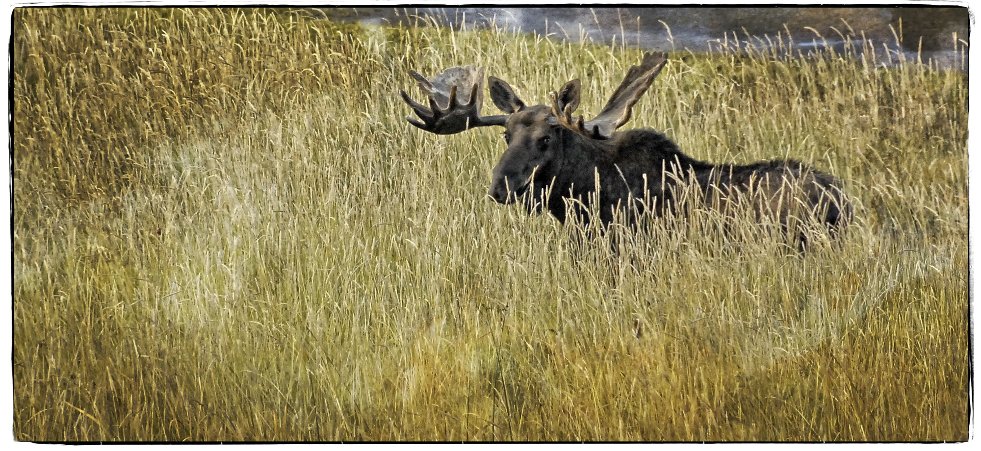
Taken in northern Alberta this moose was most interested in me at this point.
How about portraiture? I had planed to shoot at an event called “Doors Open” hosted by the Winnipeg Historical Society. During this event certain historical sites are open to the public to view and some locations provided actors in period costume reenacting events pertinent to that facility. Perfect setting for this style of vintage processing I thought. Camera in hand I specifically shot for the project and they turned out decidedly better than expected. Each photo creating a real effective ambiance, enhanced by special lighting treatments I had planed. Its always in the lighting, details and ambiance.

This ghostly murderer returns from the dead once a year.
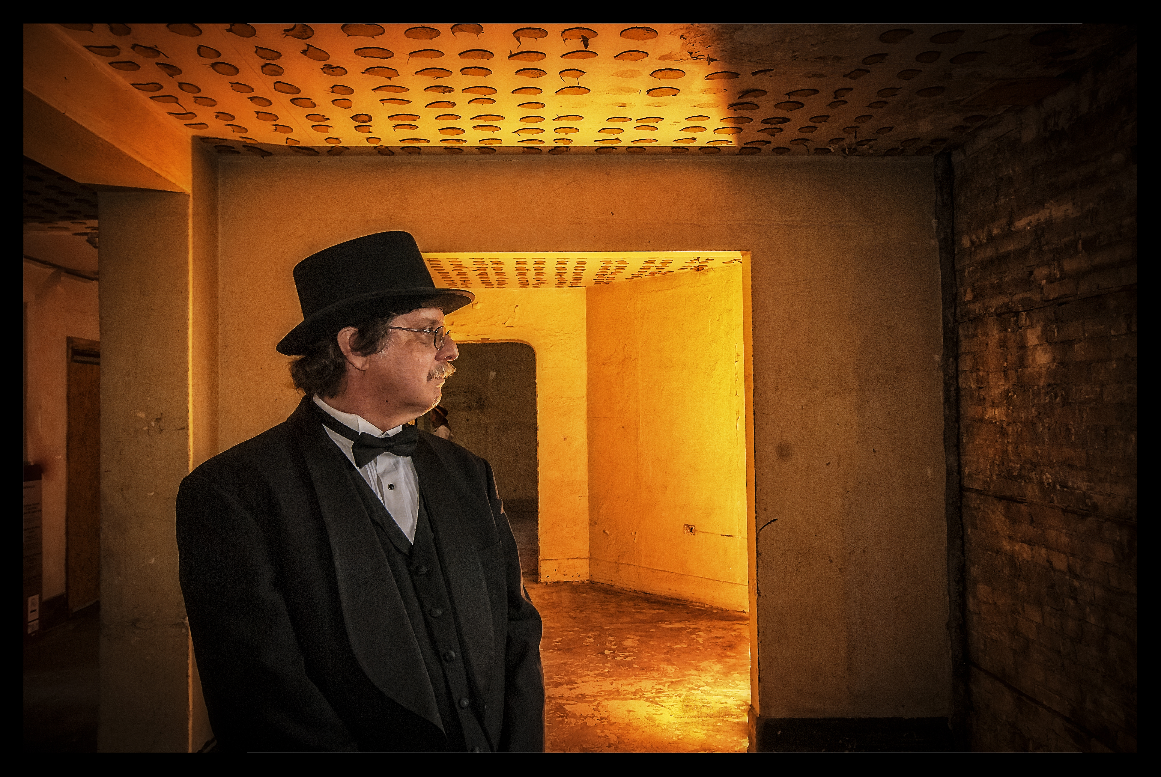
Most criminal clergy never entered these hallowed walls.

Youthful innocents, not always as it appears from the darken shadows looms danger.
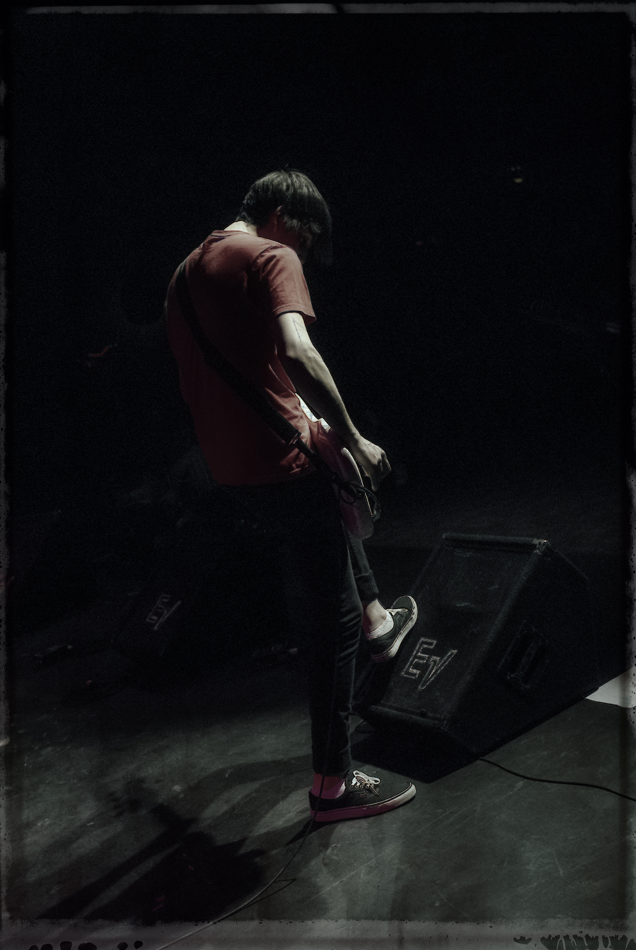
I’ve continue to experiment with this technique to include on stage performance images. Here, with a few minor tweaks it becomes a very effective grunge look for current bands, musicians and dancers. This processing pearl has been created but it is has a constant flux of evolution.

“Almost Birds”
Jared Kist
“Almost Birds”
So why go through this process and what does it mean. It means now I can effectively create an identifiable pictorialist portfolio of work that I know, trust and enjoy. I can assemble a consistent look for an exhibition or portfolio request based on this technical style in any genre of imagery. It is a concept and look that I can now promote and market to different end users. It has become a branded collection by Joe Kerr and CSCS Digital Imaging. My oyster has relinquished a pearl.
An interesting sidebar, I’ve been encouraged to teach this and other techniques in an up coming workshop series. Worth the time and efforts, you bet.
