
I think it’s a bit misleading to make a claim which vignette is best but let me explain.
“Beauty is in the eye of the beholder” Gramma Kerr
On my Facebook page I thought it would be interesting to share one image with a variety of vignette treatments to see what people think. The responses and assessments that were shared was terrific and a couple of things became clear to me that I will delve into here.
Let us just look back on what was asked for people to asses. Below are the 4 images I shared complete with the descriptors as to the intent of each style of vignette. I was looking to see if with the understanding of the intent and its application to this image would sway people’s opinion.
The image I used was taken on a Rodney Braun, Utah Tour, Aug 2018. You may recognize Elizabeth Webster the owner of Beyond Boundaries Academy she is a stunning model who knows how to project a feeling in her posses.
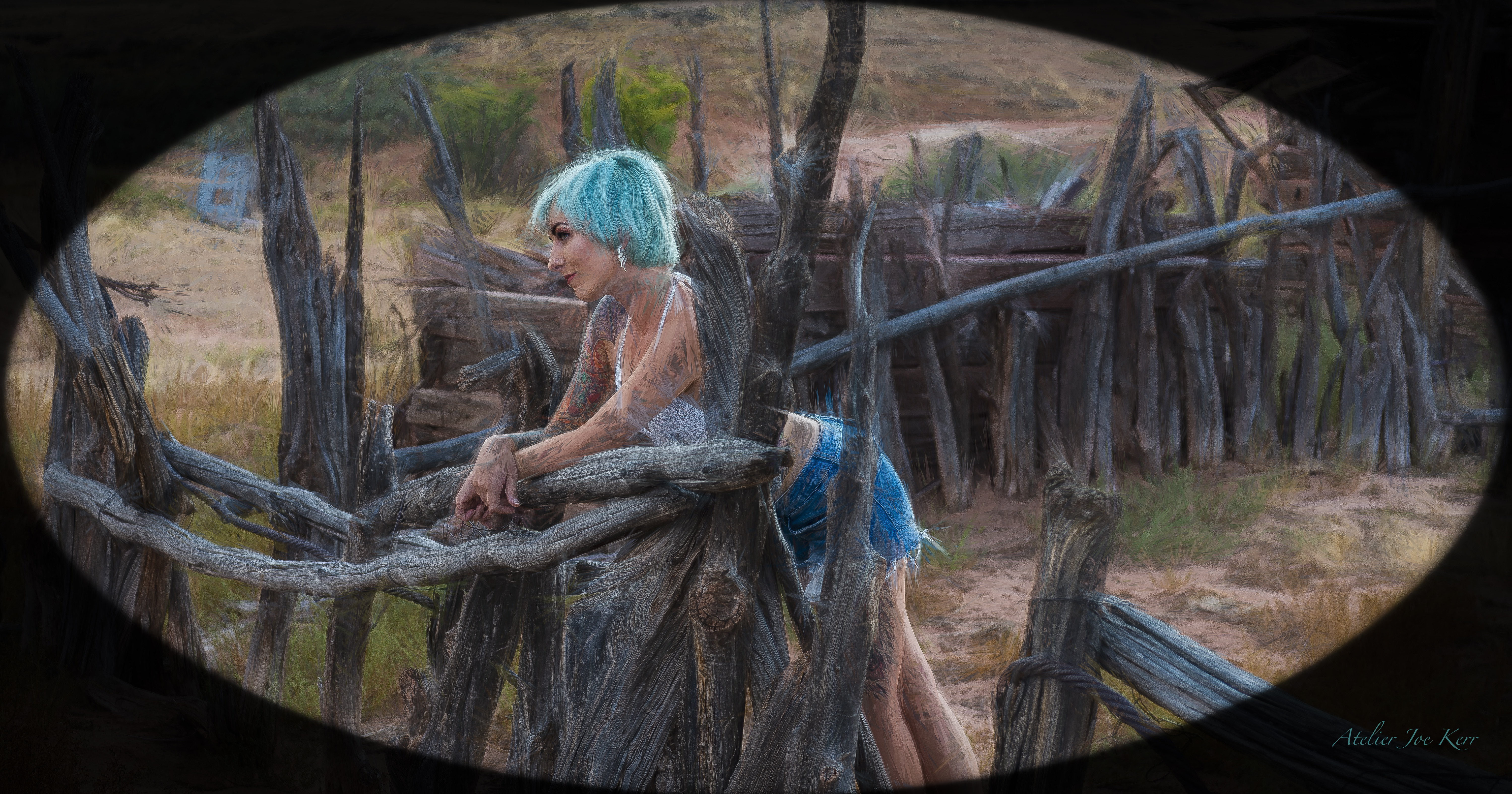
The intent here is a vintage matt appeal. When I was a young boy I remember seeing family photo of my grandparents and they always had this oval matt which resonates with me and I still find them appealing today.
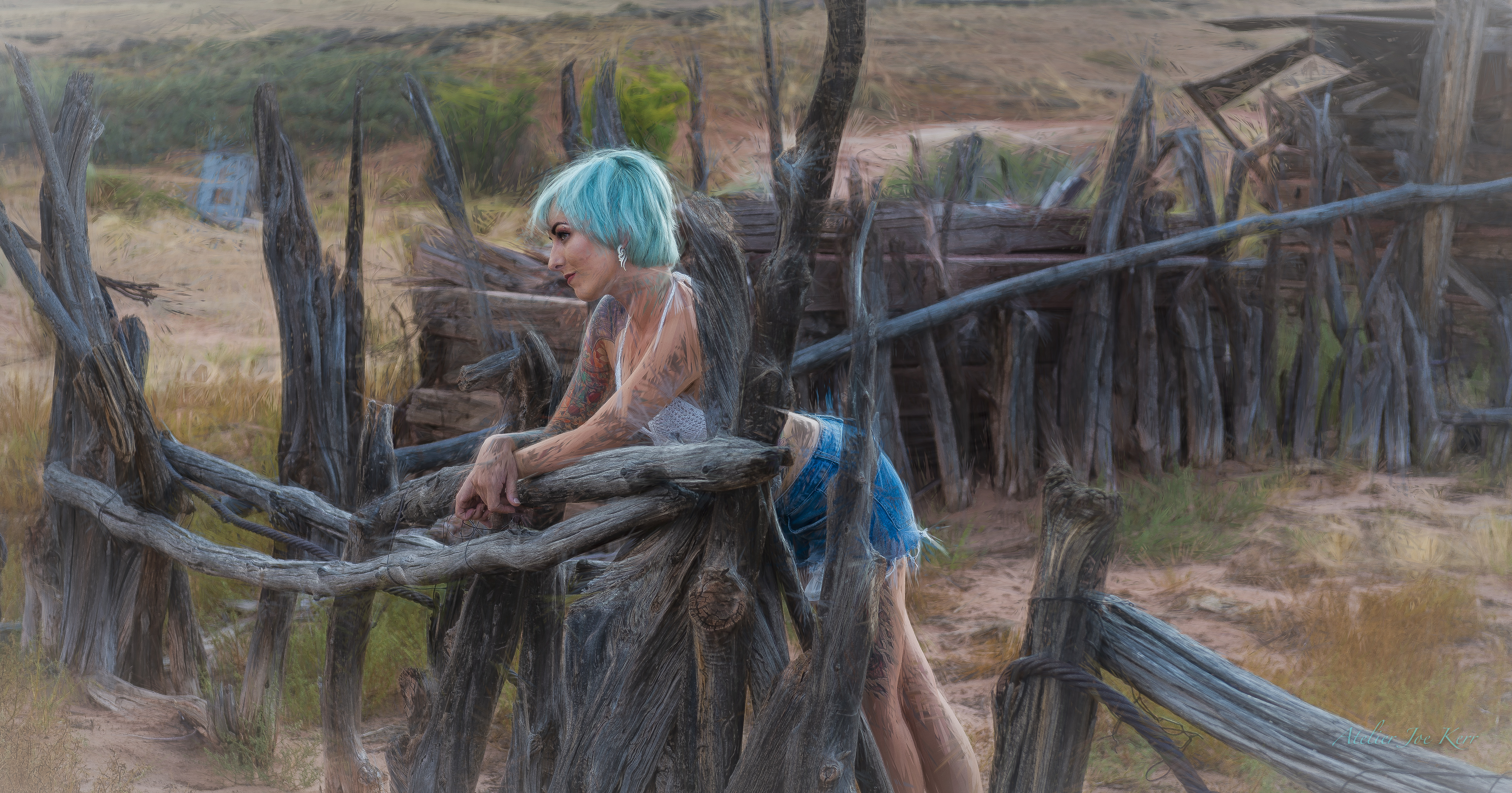
The vignette is a soft feathered beige. The intent is to quietly bring your eye to the centred subject. The light to darker contrast draws the eye to the subject in a more traditional way.
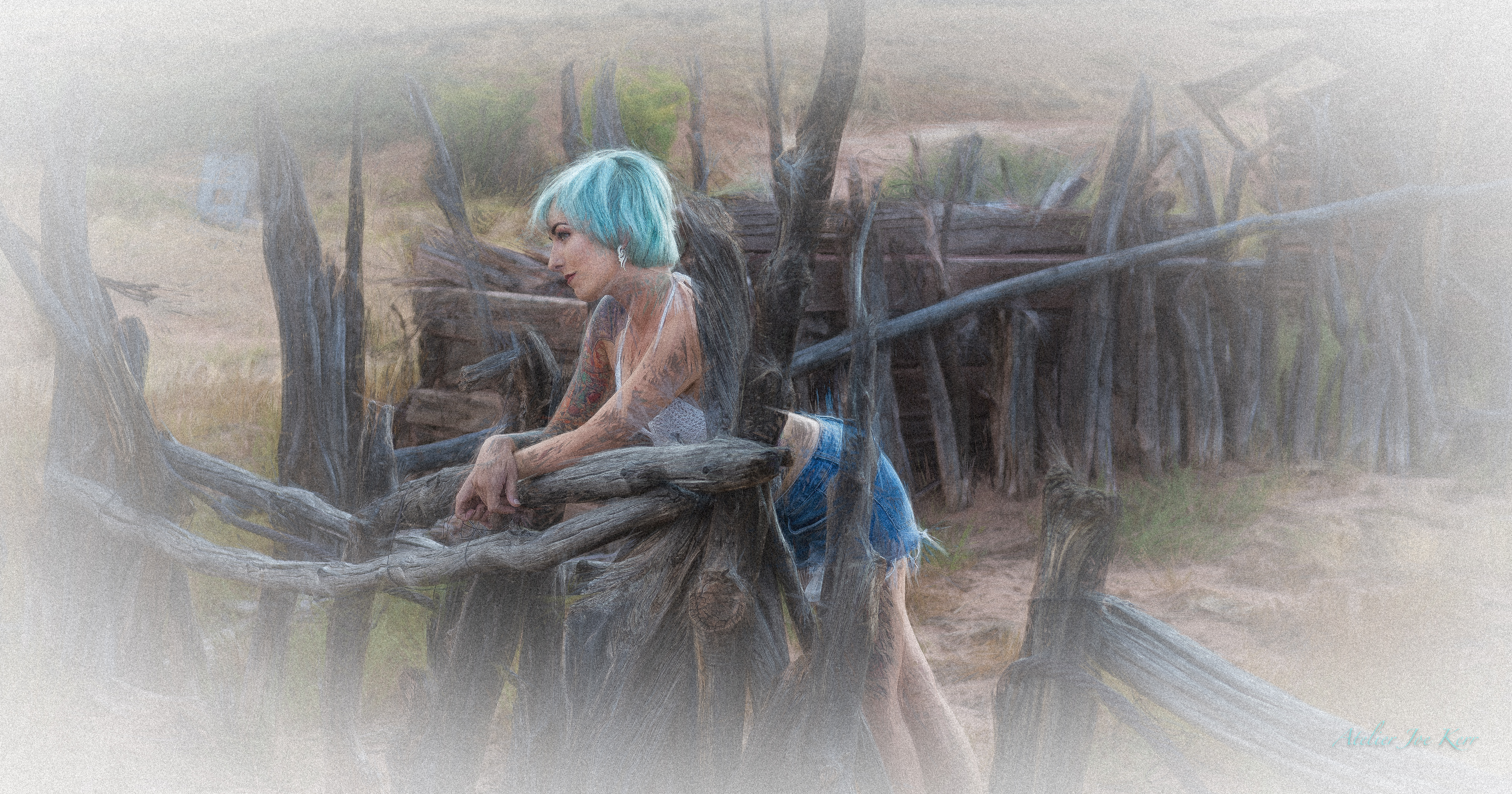
This vignette is a very large gradient, there is a grain used on the version that mimics the style of the photo. The intent of a vignette like this is to create a dream like feeling.
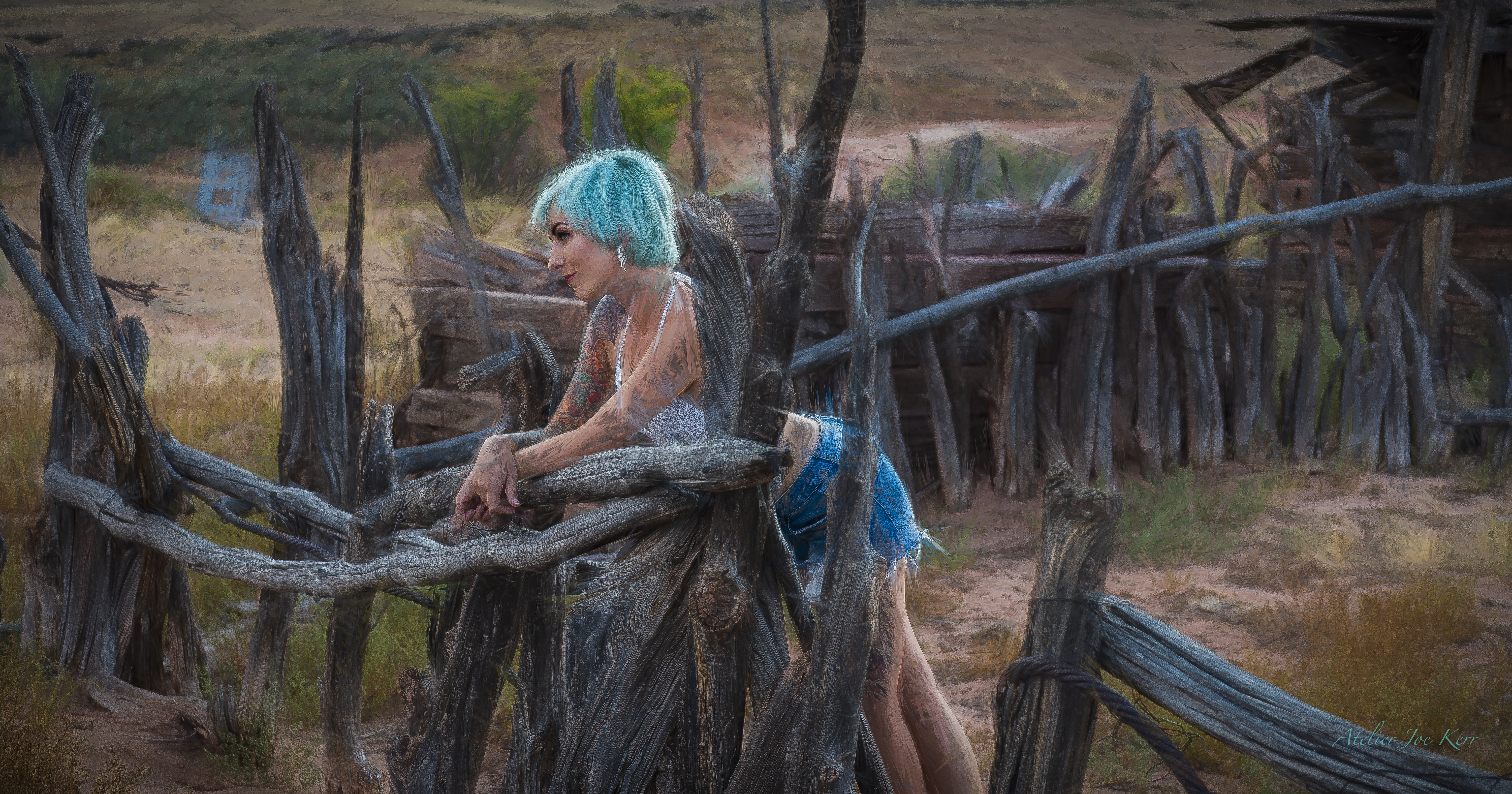
A uniform warm darkening which effectively takes the eye to the lightest area. This technique is quite common today and beautiful.
The four different styles shown here are a small sampling of what can be created with the infinite numbers of software programs available. These were created simply in LR.
So what is the best vignette style here is totally in the eye of the beholder. If you rate it by popularity #4 was by far the most popular. I anticipated that so in my minds eye it was my control image. What popularity has taught me over the years is simple. If you’re going to sell images you almost always need to follow the popular vote, don’t buck the trend. If you are perusing a fine art portfolio image, trust your heart and eye.
If your images talk to you and say it needs a soft dreamy context to help fulfil the desired result then its total your choice. This also may include a host of other possibilities like colours or textures.
The opportunities are boundless but be careful not to over step the need for a skilled assessment of your intent and how best you can enhance your image.
The choice is always yours don’t be swayed by others believe in your own instincts, it is the only way you can become artistically liberated.
